Creating a Seating Plan For a Commercial Venue
By Sophie Hardy, 15th June, 2017
The key to an efficient and successful dining area in your business is to create a great seating plan. With a well-structured layout, excellent food, and quality service, your guests or diners will feel relaxed and comfortable, enjoying their experience and wanting to return. In commercial settings, such as restaurants, bars, pubs, and cafes, the main aim is to maximise the sales area. The layout should also be a pleasant environment for customers and staff, ensuring it is visually appealing and functional for both. For venues that hold events like weddings and parties, the layout is often designed for the aesthetics, but the same principles apply to create a hospitable setting with plenty of room for everyone. We have created a simple guide to help you create the ideal seating plan for your space.
Types of Table Layouts
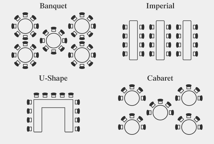
When deciding on the type of layout you need, determine which style will work best in terms of maximising space, accommodating diners, and providing an enjoyable atmosphere. Consider the type of guests your establishment attracts. For example, family settings such as weddings and fast food or buffet restaurants will usually have larger groups. A fine dining restaurant is more likely to have small groups and couples, whilst cafes and coffee shops attract more solo customers. We discuss four popular layout designs below:
Banquet
The banquet layout is typically used at weddings, parties, and restaurants. Round tables are suited to this layout but it can also work with squares arranged diagonally. The rows are usually staggered to allow sufficient room. In restaurants there is often a banquet layout in the centre of the room, with square or rectangular tables around the edges.
Imperial
The imperial layout is used in relaxed and casual restaurants, canteens, and even at weddings. It involves using long rectangular tables or several smaller ones pushed together, and it can work with either benches or individual seats. In this layout, it’s not unusual for diners to be seated beside people they do not know.
Cabaret
The cabaret design is best suited for seating at shows, performances, and awards ceremonies, or any event where guests will be looking at a stage or presentation. The chairs are arranged around one half of a circular table, with everyone looking in the same direction, this way guests can still eat a meal whilst having a clear view to the performance area.
U-Shape
U-shaped layouts can be used at small parties, private dining areas in restaurants, or for small weddings. Seats are usually placed around the outer edge of the U, creating an open sociable setting and providing easy access for waiters. The inner edge can also be used to accommodate more people.
These are just a few examples, but you can of course use a combination, which will allow for a fluid and flexible layout. You can also change the layout for different times of the year e.g. Christmas time sees big company parties and family dinners, whilst Valentines Day requires plenty of tables for two.
Number of Chairs vs. Table Size & Shape
Once you have a layout in mind, you need to decide how many dining tables you will need to meet your number of expected guests or covers. A good start is to sketch out a scaled plan of your space and try out different shapes and sizes of tables using our diagram and advice below. You may find that a combination will work best, especially if your venue is an awkward shape. It also gives the option to change the layout day to day, and is ideal for venues that get completely rearranged for corporate events and weddings.
The number of seats you can fit around each table will depend on its size and shape. You generally need to allow around 60cm width for each person, or a gap of 15cm between each chair. Our illustration below demonstrates examples of different sizes and how many chairs will fit around them.
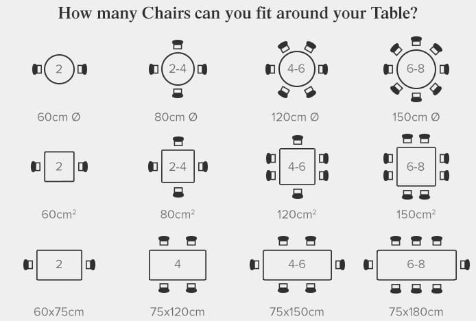
Please note, our diagram is a guide with approximate figures. Other factors such as the width of your chairs can affect your available space.
It’s also worth remembering that while each diner may be able to sit around the table comfortably, they may not have enough surface space to enjoy their meal. For example, you may have centrepieces, candles, condiments and sauces already set out, so once all the food has arrived with extra sides, drinks glasses, water jugs, and wine bottles, the surface can become very crowded.
Advantages & Disadvantages of Table Shapes
So how do you decide on the right shape for your layout? We have put together a short list of advantages and disadvantages of different shapes to help you. We are focussing on square, rectangle, and round but another less common choice is the oval, which is similar to the rectangle in its features.
Square & Rectangular
1. The rectangle is more practical as it is a neat streamlined shape, so most venues will be able to fit more rectangular designs than circular. They therefore make the most of the available space and accommodate more guests.
2. Square and rectangular designs can also be pushed together to make longer and larger tables. This allows for bigger groups and parties to be seated together.
3. Depending on the style, the legs of square and rectangular designs can get in the way, obstructing the leg room for diners sat at either end and also restricting the number of chairs that will fit.
4. The rectangular table becomes less sociable the longer the rectangle is and the more people there are. This is because diners can’t easily see or talk to every other person without leaning behind or in front of other diners.
Round
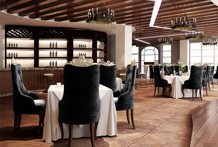
1. Unlike designs with straight edges, a round table will not create extra space by fitting flush against a wall or in a corner. To maximise floor coverage, offsetting them in rows can work well instead.
2. The round design occupies less space, both physically and visually and so it is great for smaller compact settings like coffee shops.
3. This however means that they seat fewer people. Even if the diameter of a round table is the same, the surface area will be less than a square design as squares have additional space in the corners.
4. With a circular design, the space in the centre is often wasted, but this can be used for centrepieces, extra space for shared food dishes, or even a lazy Susan.
How Table Shape Affects the Dining Experience
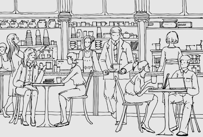
The shape of your tables can affect the overall atmosphere of your dining area. So think about the type of environment you want to create to suit your customers or guests.
Rectangular designs can reduce the sense of equality between guests, particularly for those sat on the end of the longer sides, as they are not at the heart of the conversation or party. Similarly, when the short sides are used there becomes a ‘head’ of the group, however this may be favourable for families.
Squares usually seat an equal number of chairs on each side, which creates a sense of symmetry and balance that is easy on the eye, making the overall atmosphere more calming and relaxed.
Squares and rectangles have a more formal feel. Diners are sat in lines directly opposite each other, which can feel confrontational in some settings but can be intimate with just two diners.
Round tables make guests feel more sociable, as each diner can see and converse with every other person in their party. The circular design is also more welcoming as it creates a sense of flow that invites guests to take a seat rather than abrupt straight lines that can be seen as barriers.
Our Dining Table Buying Guide has plenty of extra information, including advice on style, materials, and finishes, to help you decide.

Arranging the Layout of Your Venue
Not only do you need to provide enough room between each diner, you also need to allow adequate space between tables and backs of chairs, so guests and staff can make their way across the room with ease.
When tables are positioned back to back with no main walkway in between, leave approx. 130cm between the tables. Around 40cm is then left between the backs of chairs when seated, allowing customers to comfortably get to and from their seat. Depending on your layout, you may need to think about the spacing between chairs and walls, and we have more information about this in our Dining Chair Buying Guide.
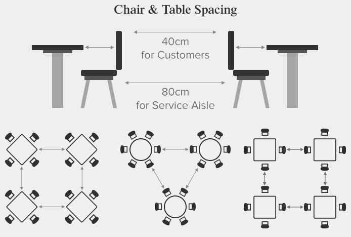
To allow for a high traffic walkway or a service aisle for waiters, allow approx. 170cm between the tables. This leaves around 80cm between the backs of chairs to allow people to easily walk between. For walkways that lead to and from doors, an easy guide is to keep the walkway at least the same width as the door.
If there is a bar area with bar stools, even more space is needed between the stools and restaurant chairs, and you may even consider creating a partition to separate these areas. This is particularly relevant if the bar is used as a social standing area or as a place for guests to wait to be seated.
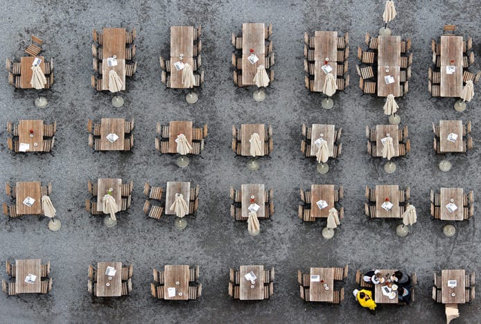
With square tables you can either use square or diagonal spacing, as seen in the image above. The square layout is more uniform and formal, whilst the diagonal is more interesting visually. If you opt for diagonal spacing, leave around 60cm between the corners of the square. This lets people walk between and also gives each party space so they don’t feel as though other diners can overhear conversations.
Lastly, be sure to check that waiters have a clear path from the dining area to the kitchen and to the bar, and ensure doorways to kitchens, toilets, entrances, and exits are unobstructed. It’s especially important not to block fire exits or walkways for fire evacuation.
Fixed Seating
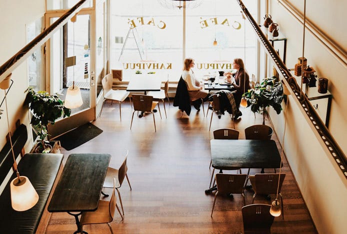
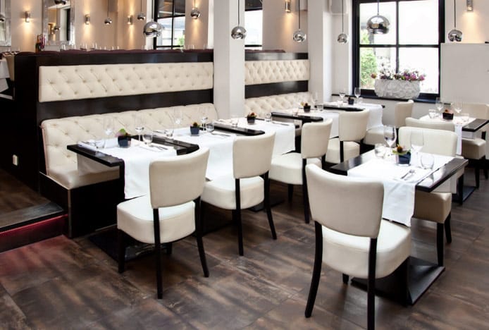
Another option to look at is fixed seating, such as booths and benches. This is more applicable to restaurant furniture rather than event layouts. A popular layout is to line the walls with booths and have an arrangement of freestanding seating in the centre of the room, but booths can also be placed away from walls and this provides easier access for customers.
Customers generally prefer booth seating as they are usually more comfortable and create a private dining area, encouraging diners to stay for longer, which is good for restaurants that don’t rely on quick table-turnover. Plus, booths can save space by filling corners and tighter areas, and can also seat more people in a smaller area compared to freestanding furniture.
Although this type of fixed seating always looks neat with no chance of untidy chairs, you can’t move it around to change the layout. In addition, freestanding seating allows easier access for the elderly and the disabled. Therefore, a combination of both will provide a more convenient and versatile seating plan. One way to do this is to edge one wall with bench seating and place tables and chairs alongside, as seen in the image below, this layout combines the benefits of fixed and freestanding seats.
There’s no perfect layout to suit all, you need to find a balance that will benefit you and your venue, but hopefully our guide has given you key features to consider to get started on an efficient and well-organized seating plan.
Recommended Articles
How to Make Cream Dining Sets Work for Your Kitchen
Nicely neutral, versatile cream dining sets boast soothing tones and classic charm..
The Best Advice for Creating a Formal Dining Room
From stylish seating to tasteful art, learn how to create a stylish dinner party space..
How To Mix & Match Dining Chairs
Get the eclectic look in your home by mixing and matching your dining chairs..
Recent Popular Posts
6 Ways to Use Texture in Your Kitchen
Six easy ways that you can use texture to liven up your kitchen design..
How to Brighten up a Dark Kitchen
Whether your kitchen's a small space, or just poorly lit, brighten it up in 5 steps..
3 Easy Steps to Scandinavian Style in Your Home
Featuring natural materials, clean lines and light spaces, Scandi style is clean and cosy..
How to Create a Cosy Corner in Your Home
Staying in is the new going out! Pop the kettle on and relax in a cosy corner..


