How To Make Your Kitchen Look Bigger
By Aurora Commerce, 5th June, 2015
When redecorating their homes, many of our customers ask our advice on how to make their kitchen look a little larger than it really is. A relaxed space to congregate with friends and family over food and drink, this central room quickly fills up with people, possessions and other inevitable clutter.
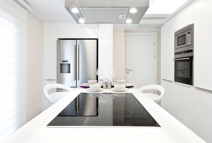
Whether your kitchen is large and open plan, or small and cosy, there are several design tricks you can use to your advantage to create a more spacious aesthetic, and ultimately a more inviting place to spend time.
Minimalist Colours
Colour can make or break a room. It plays a big part in how your kitchen looks, and whether you realise it or not, how it can make you feel. To give the impression of more space, keep things light and airy by opting for pale, neutral or soft pastel tones. Whilst a dark palette will make an interior look smaller than it really is, clean white walls will reflect the light and create a bright and breezy aesthetic.
If you want to introduce other colours, choose one or two accent shades to use sparingly around the room. But remember to keep things simple; don’t introduce a rainbow of different shades, as this will make it appear visually busy and crowded.
Don’t forget to think about the other surfaces that make up your kitchen too. We’d advise you paint the ceiling white, as dark colours overhead can lower the ceiling and make the room seem a little cave-like.
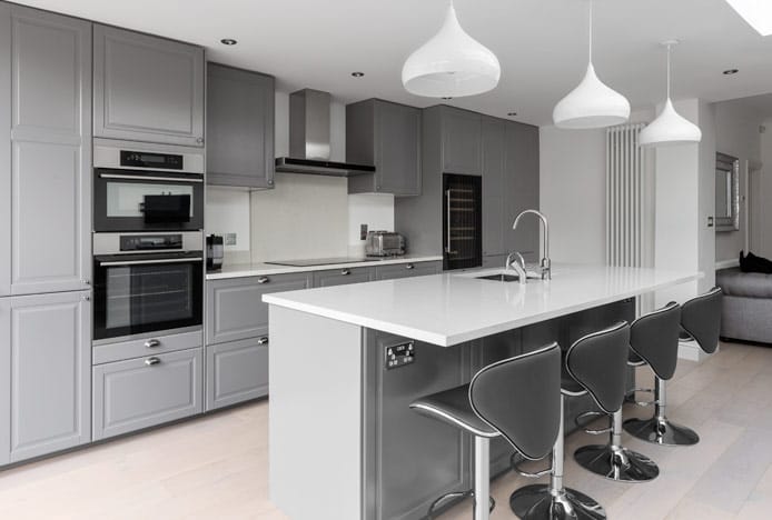
Choose glossy white vinyl or a pale wood like beech for kitchen cabinets. Or even better, replace the doors with glass to really open things up. Similarly, choose a pale worktop material, steering clear of anything too dark that will visually dominate the space.
Many people forget about flooring, but it too plays its part in how small or spacious a room can look. As well as selecting pale coloured floor tiles, you should also think about the size and shape of them. Larger tiles will trick the eye into thinking it’s a bigger space than it is, whilst laying them diagonally is another clever design hack for making narrow interiors appear wider.
Ultimately, using the same colour on all the surfaces throughout your kitchen, such as varying shades of off-white, will create a seamless look for an enhanced sense of space.
Carefully Chosen Furniture
Dining tables and chairs often form the focus point of a room, and hence it’s key they blend in instead of standing out and dominating the space. Matching the colour of your chairs to the colour of your walls is a great place to start, along with choosing visually lightweight designs with clean lines and smooth surfaces.
Our white dining chairs are ideal, with marvellously minimalist models like the Faith proving that simple can still be stylish. However if you decide you’d prefer fabric, opt for plain, block coloured cloth over patterned material, as busy prints and elaborate textures can prove distracting.

Experiment with where you put your furniture, as pushing a table and chairs up against the wall doesn’t always have the space-saving effect intended. Play around with different angles ‘til you find what works best.
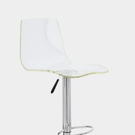
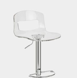
Or even better, opt for transparent seating like our acrylic kitchen stools. Cool and clear seat designs like the Odyssey let the light pass straight through, and what’s more, it’s set upon a sleek mirrored chrome frame that will reflect its surroundings for an enhanced sense of space.
Our stackable dining chairs are another great option if your kitchen is on the small side. The perfect seating choice for freeing up floor space, popular designs like our Candy Chair (pictured below) can be stacked away out of sight, or in the corner of the room, when not in use.
Less Is More
Do your best to avoid clutter, keeping work surfaces clear and accessories to a minimum. Too much mess, whether it's unopened post or overflowing recycling boxes, will make your kitchen look untidy and overcrowded. Think about what you use every day and need within easy reach. Keep essential items like the toaster and kettle out on the counter, and move infrequently used appliances, crockery and recipe books to the cupboards.
Don’t worry - you can still have your favourite photos, artwork and accessories out on display. But choose a few carefully selected pieces rather than packing in as much as possible.
For the minimalist look, choose backless kitchen stools that will tuck nicely under the counter when not in use. Our Oliver is an ideal example, its compact design taking up minimal visual space.
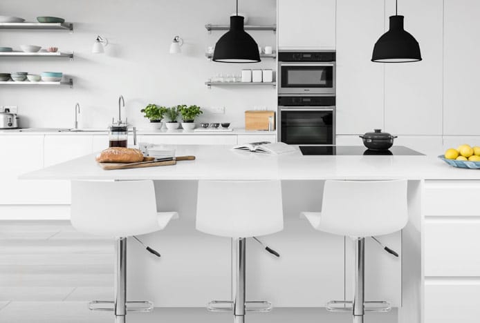
Maximise On Storage
The kitchen is ideal for storage thanks to the number of built-in cabinets. Use them to store not only food, drink and kitchenware, but also any odds and ends to help keep the worktops clear.
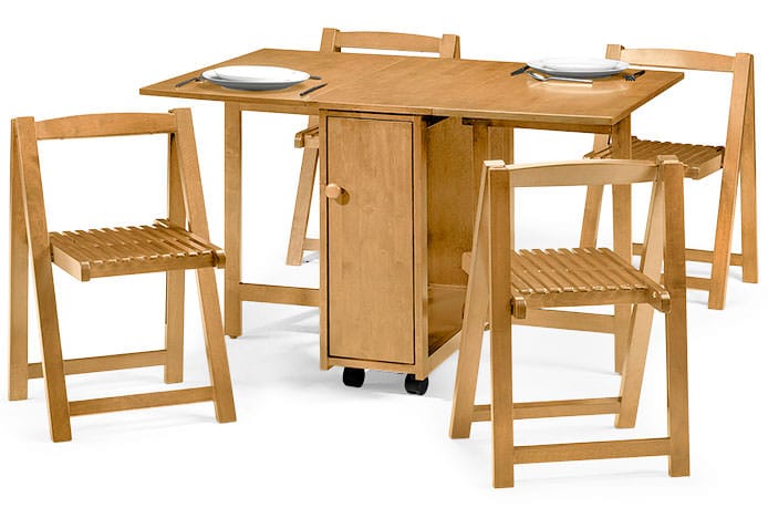
Need a little more storage space? Discover the magic of multi-purpose furniture, such as our Crantock Folding Dining Set. With a handy storage cupboard within the table, you can store everything from the salt and pepper through to candlesticks and tablemats. Plus, both chairs and table can be folded away when not in use – freeing up precious floor space.
Our Cocoon Storage Stool is another clever item that will help keep your kitchen neat and tidy. Perfect for keeping in the corner of the room as extra seating, it can store everything from stereo remotes to photo albums within.
(January 2017 - Please note, the Crantock and Cocoon are no longer available.)
Let In The Light
Light, or lack of it, can drastically affect the appearance of any interior. To make your kitchen look bigger let in as much natural light as possible, whether through standard windows or a skylight overhead. When it comes to window coverings, choose light gauzy or netted curtains over thick drapes or heavy blinds.
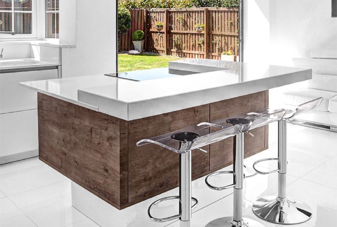
Shimmer Translucent Stool Clear
Don’t have many windows? Not to worry. Artificial lighting at different heights, such as overhead spotlights, pendant lamps or under-cabinet bulbs, can work wonders. Your aim should be to illuminate the room as much as possible, eliminating any shadowy corners.
Mirrors are another great trick to make a room appear larger. Placing them opposite or nearby a window will reflect the natural light, bouncing it around the room to brighten it up.

Mustang Bar Stool Antique Slate
So there you have it, all you need to make your kitchen a light, bright and welcoming space. But if you need a little more inspiration, why not check out our Less Is More pinterest board. It's full of minimalist décor ideas that are sure to help you on your way to creating a kitchen with maximum style and minimum clutter.
Recommended Articles
Smart Storage Solutions For Your Kitchen
Want the minimalist look in your kitchen? Use smart storage to clear the clutter..
How to Brighten up a Dark Kitchen
Whether your kitchen's a small space, or just poorly lit, brighten it up in 5 steps..
Recent Popular Posts
3 Easy Steps to Scandinavian Style in Your Home
Featuring natural materials, clean lines and light spaces, Scandi style is clean and cosy..
6 Ways to Use Texture in Your Kitchen
Six easy ways that you can use texture to liven up your kitchen design..
How to Brighten up a Dark Kitchen
Whether your kitchen's a small space, or just poorly lit, brighten it up in 5 steps..
How to Create a Cosy Corner in Your Home
Staying in is the new going out! Pop the kettle on and relax in a cosy corner..


 Odyssey
 Shimmer
 Stardust
 Faith
Faith Candy
Candy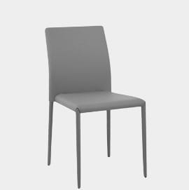 Joshua