Juxtaposition In Interior Design
By Sophie Hardy, 26th May, 2016
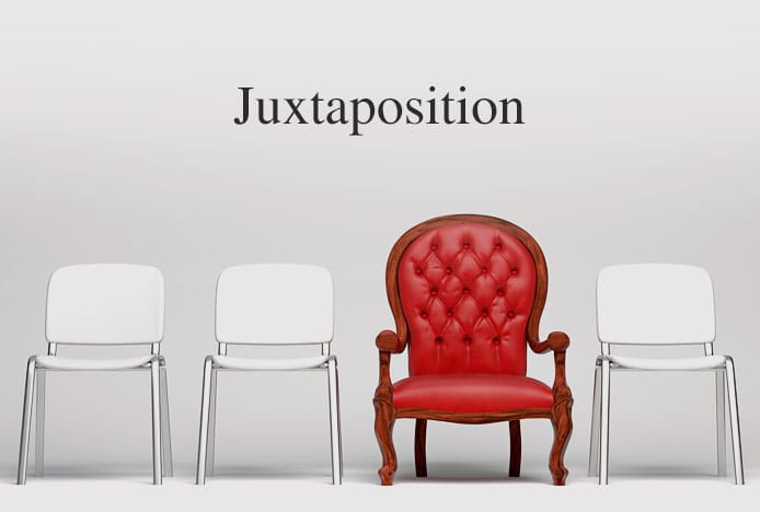
Regularly used in art and music, juxtaposition is becoming increasingly popular in interior design. It tends to be a controversial subject, but can be applied in a variety of ways. It can be used to mix conflicting designs in the same room, or on a grander scale, to modernise a historic home or even bring a vintage vibe to a new build. In this article we show you some examples and weigh up the pros and cons.
We have picked out six examples of rooms with contrasting styles, and each one has taken a different approach. Read on to find out how you can successfully achieve the look in your home.
Retro Victorian Kitchen
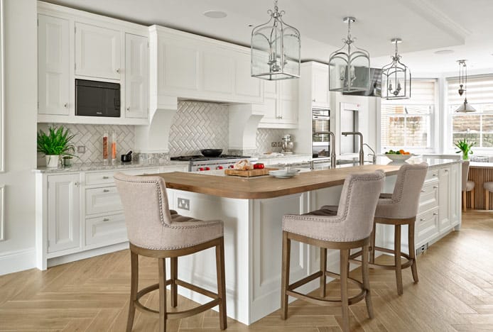
In the kitchen pictured below, you can identify the house as Victorian due to the high ceilings, wooden cabinetry, architraves and bay window situated at the far end of the image. The wooden flooring has been chosen to keep with the original structure of the house, whereas the cream cabinets, brushed steel appliances, and bold pendant lights have a truly modern appearance. Creating further juxtaposition, the kitchen stools have a modern antiqued finish, giving the room a slight country feel. It therefore combines three individual styles, and yet nothing looks out of place.
Knightsbridge Oak Stool Tweed Fabric
The trick is to create links and visually connect the differences. You can see the traditional flooring and industrial stools work well together because of the use of lightwood, whilst the dark metal frames also complement the dark cabinets. You should also ensure that the room is balanced, here the bright yellow lamps and white walls offset the heavy quality of the antique furniture and thick stone countertops.
Contemporary Georgian Kitchen
Here, a Georgian home boasts a kitchen with contemporary fittings. The distinct high ceilings, large sash windows and shutters, cast iron radiators and detailed architraves are all indications of the period architecture. A traditional chandelier has also been selected to suit the character of the home, whilst spotlights are an opposing choice. Shaker style cupboard doors add to the timeless aesthetic whilst the square handles and state-of-the-art integrated appliances provide a twenty-first century appeal. Completing the look, the chrome ABS bar stools introduce a trendy retro vibe.
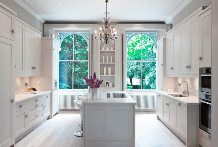
The contrasting elements of the room are connected by the white monochrome colour scheme, even the flooring, despite being classic wood, has a white wash to fit the room. This approach allows you to effortlessly blend décor styles, you can then use accent colours for added juxtaposition and to highlight preferred areas or features, as seen here the eye is drawn to the purple flowers.
Modern Country Kitchen
The next image is a stunning example for those who love country décor but also want modern luxuries. The cabinets have a classic farmhouse look and the wide plank oak flooring matches this, but its diagonal placement adds a fashionable twist. The units have been given a crisp white finish, which is offset by an antiqued cupboard and a similar rustic dining table. An innovative wine cellar and the latest brushed steel appliances introduce stylish practicality, whilst the bar stools and pendant lamps have a funky retro appeal for an added contrast.
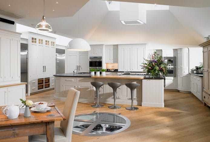
Choosing a traditional design in a fresh and innovative colour can be a small starting point for those who are unsure. As seen here, the light colour of the units brings a cool and crisp aesthetic to the predominantly wooden space, with the walls and ceilings adding to this, and providing a subtle backdrop for the metallic appliances.
New York Warehouse Apartment
For a unique take on the concept, this warehouse apartment has been furnished to create an ultramodern setting. The exposed brick and steel framed windows are typical industrial interior qualities, and despite being new, the wooden flooring has been selected to complement this. Juxtaposing the factory-style exterior is the chromed furniture and decorations, with the high shine finish on the acrylic bar stools and glass bar table bringing elegance to the rough appearance of the brick.
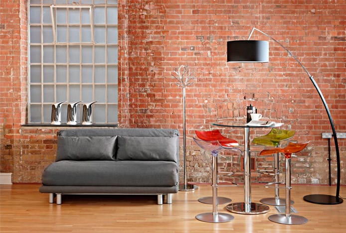
The black floor lamp is a retro addition, proving that you can include a variety of designs with surprising success. You should, however, stick to two or three styles, as too many can overcomplicate the space, with different features and elements fighting for attention.
On Trend Rustic Kitchen
Adding an extension to an older home is a great chance to update the interior. In the image below, there are a variety of considered combinations that effortlessly blend rustic character with innovative style. An upmarket Aga oven now occupies the original fireplace alcove, with copper cookware displayed above for that vintage aesthetic, whilst the kitchen island has a fashionable look because of the twenty-first century gas lift bar stools. In the dining area, a classic chandelier and aged lantern ornaments complement the antiqued refectory table, but pairing it with chrome dining chairs creates a stunning mix of old and new.
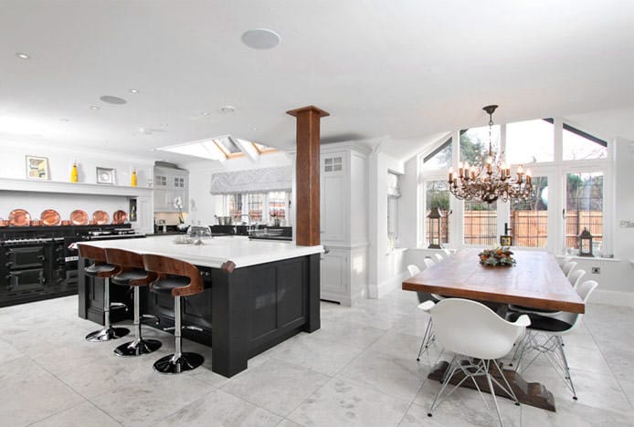
Often when updating or extending a period home, the existing beams and supports become an obstacle in the middle of the room. Here the beam has been incorporated into the new kitchen island, and the wooden table and bentwood bar stools counteract its dominant appearance.
Chromed Farmhouse Kitchen
This Edwardian house has been renewed with the use of the latest materials in kitchen design. The fireplace alcove with an Aga oven is an indication of the traditional structure, but this is updated with a chic black granite backsplash and matching work surfaces. Architraves, wooden cabinets, and a Belfast sink, challenge this look with their farmhouse appearance, resulting in a country kitchen with contemporary flair. Sleek polished finishes are sought after in modern interiors, and the oversized chrome accessories and acrylic bar stools certainly work to add a present-day panache to this space.
Juxtaposition can also be used to make a focal point in the room, here the kitchen island cabinets have been painted blue, separating it from the otherwise monochrome colour scheme.
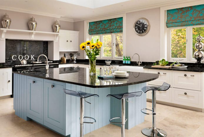
Shimmer Translucent Stool Smoked
As with any style choice, there are advantages and disadvantages when implementing juxtaposition within the home. We have created a list of pros and cons to help you decide if this is the look for you:
Pros
- It brings character to a home, for example, industrial furniture can give a quirky edge to a contemporary space that may otherwise appear too clinical, whilst clean and minimalist décor adds practicality and convenience to a traditional space.
- There are inexpensive options - simply introduce contrasting furniture or accessories to your existing interior if a complete upgrade is too costly. This is also safer than remodelling the entire room and discovering the end result doesn’t work.
- In open plan spaces it can work to define zones, for example, you may have a vintage dining area with classic dining chairs, whilst the kitchen has state-of-the-art appliances and units.
- Great for those who can’t decide on one single look, and when you get the balance right you can create a truly unique design suited to your personality and preferences.

Cons
- Juxtaposition is not everyone’s cup of tea so the unique styling may be daunting to others. Therefore it may be difficult to sell your home in the future, as buyers will expect to see décor that matches the design of the house.
- If you choose to completely renovate the space it can be a big and expensive gamble that is easy to get wrong. There is a strong element of risk and experimentation when mixing opposing styles so it’s best to start small.
- Removing historical details in a period house could reduce the value. If your home is listed, you may not have permission to change the structure, this could include fireplaces, exposed beams, coving and cornicing, and windows.
- An interior that matches the architecture of the house will still look good in years to come, but current décor trends in an old house may have a short shelf life and become dated.
Recommended Articles
Lagom: The Latest Trend For 2017
Lagom is the next big trend for 2017, find out how to introduce it to your home..
What is a Japandi Interior?
Mix Japanese and Scandinavian style for a relaxed minimalist look in your interior..
Love Your Curves in Your Home
Meet the latest interior trend that's visually striking and perfectly practical: Curves..
3 Easy Steps to Scandinavian Style in Your Home
Featuring natural materials, clean lines and light spaces, Scandi style is clean and cosy..
Recent Popular Posts
3 Easy Steps to Scandinavian Style in Your Home
Featuring natural materials, clean lines and light spaces, Scandi style is clean and cosy..
6 Ways to Use Texture in Your Kitchen
Six easy ways that you can use texture to liven up your kitchen design..
How to Brighten up a Dark Kitchen
Whether your kitchen's a small space, or just poorly lit, brighten it up in 5 steps..
How to Create a Cosy Corner in Your Home
Staying in is the new going out! Pop the kettle on and relax in a cosy corner..


