Greenery: Colour of the Year 2017
By Sophie Hardy, 5th January, 2017
Announced at the beginning of December last year, Pantone, the global specialists on colour, have named Greenery as 2017’s colour of the year. Following 2016’s unusual choice of two shades, Rose Quartz and Serenity, this is a vibrant and zesty contrast. Set to inspire all aspects of design, its popularity can already be seen in fashion, interior design, furniture, art, and even cars.
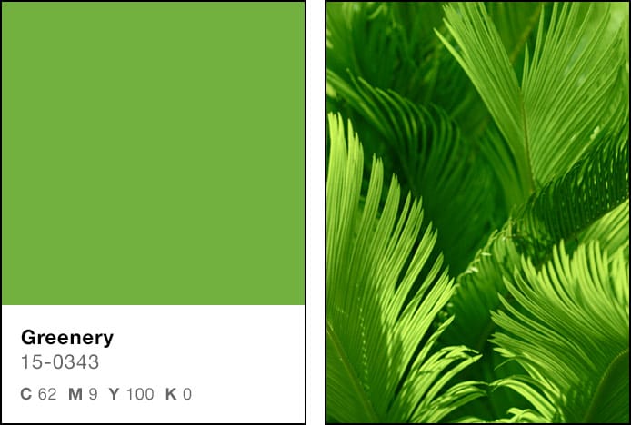
Predominantly used in print, Pantone release the CMYK values (Cyan 62, Magenta 9, Yellow 100, Black 0) for their colours, which can be seen in the image below, alongside a unique reference code – e.g. Greenery 15-0343.
Associated mostly with nature, the colour green is only present due to a pigment in plants called chlorophyll, which is necessary for photosynthesis. It absorbs red and blue visible light and reflects green, which gives the plant its colour. Therefore, as a sign of life, we instinctively find this colour safe and reassuring, which is one of the reasons it was chosen for this year.

As a particularly vivacious shade, it has many positive attributes and meanings:

Psychology of the Colour Green
All colours are said to have different meanings and a different effect on our mood, the same can be said for the colour of the year. With its organic roots, it often represents growth and progress, and is therefore seen as a positive colour - think of the phrase ‘given the green light’. It is also peaceful, calming, and relaxing, often used to illustrate safety and health, in a hospital for example.
There are various superstitions and beliefs associated with green within different places and cultures. It is the national colour of Ireland with the shamrock representing good luck, and also signifies eternal life in Japan. Meanwhile, darker shades such as Emerald, Pantone’s 2013 Colour of the Year, can evoke certain negative connotations like envy and greed.

How To Introduce Greenery Into The Home
The easiest way to embrace it in the home is to introduce actual greenery! You could make a statement with a large houseplant in the living room, add a vase of flowers to the dining table for a dynamic centrepiece, or create a kitchen herb garden that is both colourful and useful.
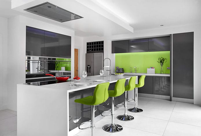
For a dramatic look, use it as the dominant paint colour in your interior, or choose patterned floral wallpaper with shades of green to bring the outdoors in. Or for those who are less daring, a feature wall in this vibrant shade will make an exciting focal point. If you prefer neutrals, use it as an accent in smaller features with green bar stools or dining chairs like the Grafton. Bring it in subtly in the lighting, artwork, and soft furnishings, or go all out with a glossy splash back as seen in the image below.

Representing all things natural, it’s a fresh and flavourful choice for the kitchen, but its relaxing qualities are also ideal for dining areas, living rooms, and even the bedroom. What’s more, the human eye can see more shades of green than any other colour, so you’re guaranteed to find one to suit you and your home. As a starting point, why not take a look at our selection of dining chairs in this stunning shade below:
For more inspiration on how to use 2017’s Colour of the Year, take a look at our Go Green Pinterest board.
Recommended Articles
How Light Affects Colour
We explain how the colour temperature of light can have an impact on your colour scheme..
Classic Blue: Colour Of The Year 2020
This year's colour of the year is blue, the worlds favourite colour..
Ultimate Grey & Illuminating: Colour of the Year 2021
2021’s colours of the year have arrived. Get inspired with shades of grey and yellow..
Marsala: Colour of the Year 2015
Colour of the year is Marsala- a deep red brown shade that's super sophisticated..
Recent Popular Posts
3 Easy Steps to Scandinavian Style in Your Home
Featuring natural materials, clean lines and light spaces, Scandi style is clean and cosy..
6 Ways to Use Texture in Your Kitchen
Six easy ways that you can use texture to liven up your kitchen design..
How to Brighten up a Dark Kitchen
Whether your kitchen's a small space, or just poorly lit, brighten it up in 5 steps..
How to Create a Cosy Corner in Your Home
Staying in is the new going out! Pop the kettle on and relax in a cosy corner..


