Ultimate Grey & Illuminating: Colour of the Year 2021
By Jack Morris, 14th April, 2021
Since the year 2000, the Pantone Colour Institute have been selecting Colours of the Year in order to reflect our everchanging social landscape, and aspirations in the world of interior design. For 2021, and for only the second time since this tradition began, Pantone have in fact selected two colours to share the spotlight, these being Ultimate Grey and Illuminating.
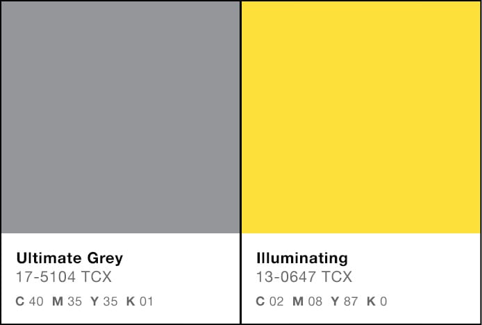
You can find images of these celebrated tones below, along with their CMYK values. As you will see, these recognisable hues are very effective in contrast and look distinctively handsome when placed side by side.
With many of us looking to the future – a future characterised, we hope, by a move beyond the many hardships created by the COVID-19 pandemic – Ultimate Grey + Illuminating is a blend that signifies both hope and rejuvenation. Ultimate Grey offers a grounded, practical and contemporary ethos which is offset by the vibrant cheer of Illuminating, a telling choice of name which signals a newfound positive outlook.

To commemorate these choices, we’ve put together a guide on using shades of grey and yellow to bring a similarly inspiring touch to your interiors.
Using Grey and Yellow in the Home
The benefit of these colours is that the latter stands out vividly against the former. Grey is often regarded as a soothingly neutral colour, but the sheer variety of tones available means that pairing different shades can add real depth to a room. Combine this versatility with the brightening effect of yellow, and it becomes apparent how easy it is to make focal points, or to run transformative veins of colour throughout.
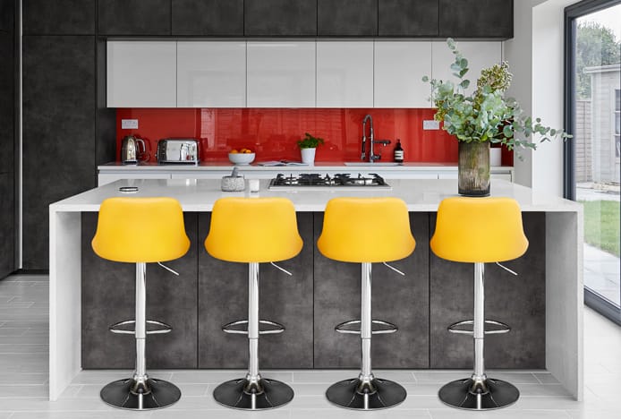
Particularly dark greys are especially striking in juxtaposition with bright colours, which means that accenting fixtures through the addition of yellow furnishings can be very effective. Yellow, with its bold overtones, can be used to foreground certain items while more neutral shades offer a balance. For example, a row of colourfully upholstered stools at a bar readily draws the eye and emphasises comfortable places to sit.
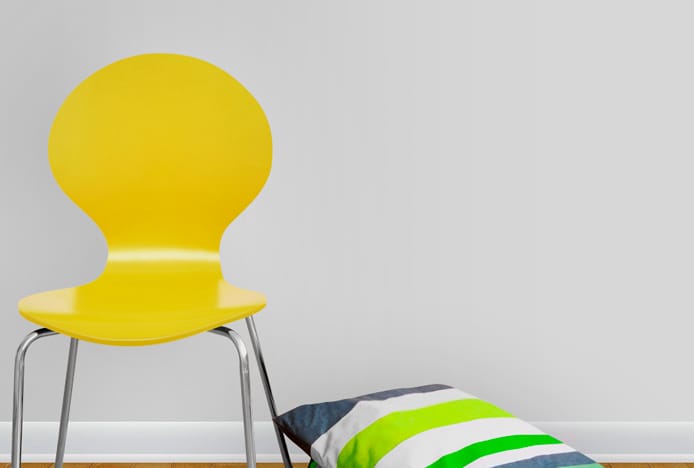
One of the most desirable aspects of this fusion is how contemporary this can appear in situ. An obvious example would be use in Scandi inspired furnishings, often synonymous with trendy modern homes, which frequently look great in profile with both colours. The combination of sunny yellows, bold greys and rustic wooden textures and finishes makes for a warm feeling, seasonal interior, as can be seen in the image below.
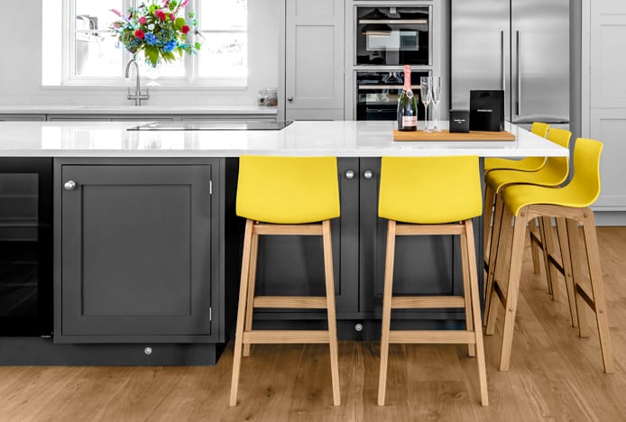
Drift Oak And Yellow Bar Stool
If you’re feeling particularly daring, the modernity of grey-yellow combinations also lends itself to urban themed décor. Concrete, distressed or otherwise patterned textures, when contrasted against a vivid yellow, can produce a signature industrial look in a kitchen or dining area. Experimenting with metals or metal tones on top of this blend can also be rewarding.
On the other hand, the classical associations of certain gold or mustard tones allows for a more sophisticated impression where required. A traditional setting which uses these colours can be improved with touches of soft fabric or velvet, or with dark greys for a striking contrast.
As a final thought, and for even greater originality, you can try incorporating other colours alongside a grey-yellow scheme, maximising your room’s potential. Black is famously adaptable and putting together an interior where black furnishings mediate between vivid yellow surfaces and lighter grey accents can mean greater definition. White is also a fantastic choice, with this years Pantone choice offsetting the more clinical aesthetic that white walls and fixtures can sometimes have and lending a refreshing balance.
Histories of Grey and Yellow
While the combination of Ultimate Grey + Illuminating may be considered a sign of the times, it’s interesting to look at the changing historical connotations of grey and yellow given the reasons for their ‘Colour of the Year’ status.
In the Middle Ages, grey was the colour typically worn by the peasantry as well as certain religious orders, including the Franciscan friars of England and Scotland who eventually became known as the grey friars. As this was the colour of undyed wool, it was associated with humility.
During the 17th century however, the use of grey became increasingly common in portraits such as those by the artist Rembrandt, due to how useful it was as a background for gold pigments and skin tones. An oil painting technique called grisaille, derived from the French word gris meaning grey, involved composing a painting in duller shades, and then adding thin glazes on top. This would make the shading beneath visible through the layers of coloured paint and allowed for greater detail as well as an emphasis on the brighter overlaid tones.
By the mid-19th century, grey had burst through into the world of commercial fashion as well, with light grey business suits becoming popular among men in the summer and dark grey suits becoming more of a norm in winter months. This would have been due, in no small part, to perceptions of grey as a colour which was disciplined and sensible, and this is clearly still the case today.
Meanwhile, yellow pigments have been observed in some of the oldest known paintings in the world, found for example in a French cave painting estimated at around 17,300 years old. It is a colour which been linked to feelings of warmth, humour and light-heartedness.
As opposed to grey, the colour yellow is also commonly associated with wealth and fortune. In Ancient China, guests of the imperial household were welcomed in on a yellow carpet, while the Ancient Egyptians frequently used shades of yellow and particularly gold in decorating tombs.
With this context in mind we can see that grey and yellow, despite having very different meanings throughout history, are also very suitable complements. Grey as a reliable, unassuming choice, and yellow as a more outgoing and effervescent partner, make the best of our understanding of both colours, and their subtle effects when used in fashion and design.
Ultimate Grey and Illuminating may be Pantone’s favourites for 2021, but our attractive range of bar stools and dining chairs includes many different kinds of grey and yellow, with many different styles and materials on offer. Why not take a look through our extensive selection and start planning a fresh new look for your home?
Recommended Articles
Greenery: Colour of the Year 2017
The must-have colour of the year is Greenery, a fresh and revitalising shade..
How Light Affects Colour
We explain how the colour temperature of light can have an impact on your colour scheme..
Classic Blue: Colour Of The Year 2020
This year's colour of the year is blue, the worlds favourite colour..
Marsala: Colour of the Year 2015
Colour of the year is Marsala- a deep red brown shade that's super sophisticated..
Recent Popular Posts
3 Easy Steps to Scandinavian Style in Your Home
Featuring natural materials, clean lines and light spaces, Scandi style is clean and cosy..
6 Ways to Use Texture in Your Kitchen
Six easy ways that you can use texture to liven up your kitchen design..
How to Brighten up a Dark Kitchen
Whether your kitchen's a small space, or just poorly lit, brighten it up in 5 steps..
How to Create a Cosy Corner in Your Home
Staying in is the new going out! Pop the kettle on and relax in a cosy corner..


