Theory of Combining Colours in the Kitchen
By Aurora Commerce, 5th July, 2015
Used by interior designers and amateurs alike, colour combining is a popular method that uses the colour wheel to find harmonious combinations that will enhance any interior space. Split into three different types - monochromatic, analogous and complementary - we show you how to find the ideal one for you and your kitchen.
Colour Theory
It’s undeniable that colour sets the mood of a room. Just as there are cheerful and upbeat colours, there are also more muted shades that exude a calm and relaxing vibe. Whilst some shades will warm a room up, others will cool it down. Some will make a room appear larger, whilst others do the opposite in creating a darker and more enclosed space.
It stands to reason then that some colours will work better than others in the kitchen. Due to the nature of the room, a social hub in the centre of the home, it pays to use not just colours you can live with, but those that will boost your mood and start your day off right.
Monochromatic
Simple yet stylish, a monochromatic palette uses one unifying colour in various tints and shades. The use of only one key hue means opposing colours won’t compete for attention, typically creating a less distracting and more balanced aesthetic. Nevertheless, the hue you choose is ultimately what will dictate the feel of the room, and as there is a rainbow of choice out there, each delivers its own look.
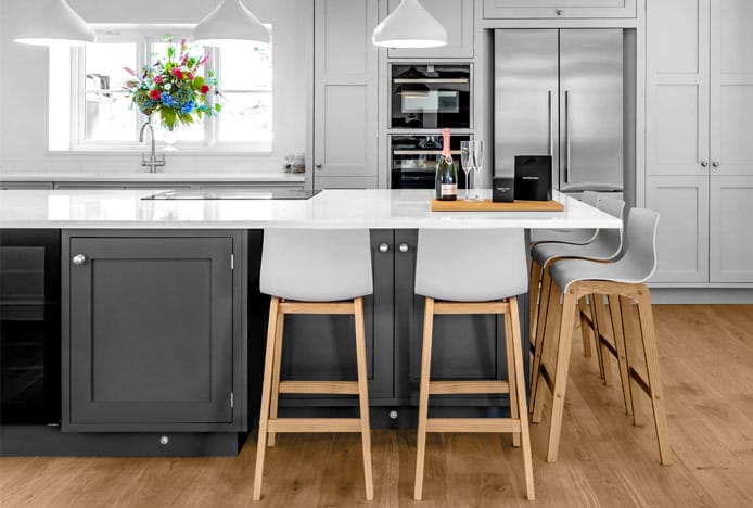
For example, zesty orange used in the kitchen will produce a dynamic, energising space with an upbeat and tropical vibe - our collection of orange kitchen stools proving ideal. Conversely, blue will cool things down, lending a relaxing, soothing and oceanic ambience.
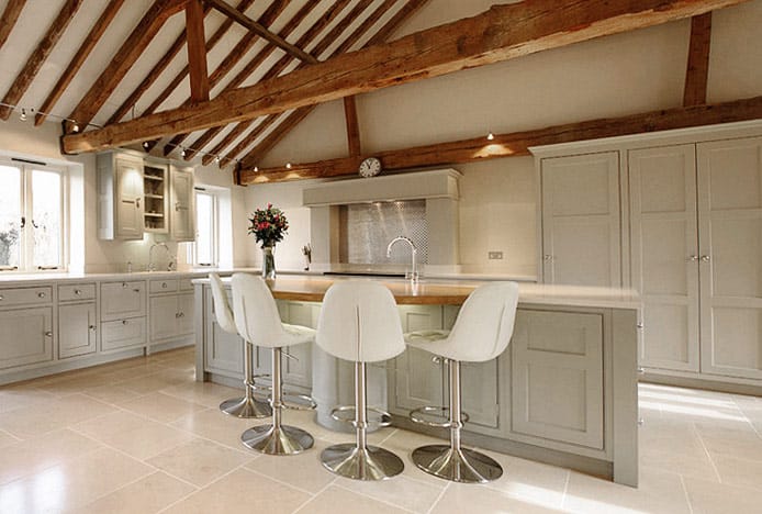
Alternatively, the kitchen pictured below uses a cream palette to create a clean, crisp, yet welcoming space. Smart and sophisticated, similar shades are utilised on the cabinets, flooring, and walls, with our divine Rochelle Brushed Steel Stool Cream providing the unifying hue that holds it all together.
Analogous
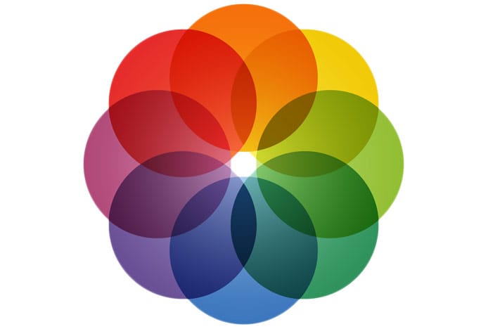
If you’re wary about being too daring with your colour scheme, but find the monochromatic approach a little boring, then an analogous palette provides the perfect halfway house. Utilising shades found directly next to each other on the colour wheel, this method creates attractive spaces that are undeniably pleasing to the eye.
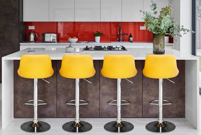
Popular colour combinations include warm and cool palettes. The first draws on yellows, oranges, reds and pinks to lend a bold, bright and exotic vibe. The latter can utilise blues, purples, whites and greys to create a kitchen with a more subdued and peaceful tone. For example you could pair yellow bar stools with warm tones of orange and brown, as seen in the image below – it all depends on the look you prefer for your home.
The most successful colour combinations are often found in nature and can be drawn upon to give your kitchen a real natural beauty. Earthy tones such as greens, browns, greys, and creams will create an organic and grounded space with that back-to-nature feel.
If you like this rustic look then choose wooden kitchen cabinets and matching furniture, such as our popular wooden kitchen stools, which are great for adding texture and depth. Plus, extra green can be added through floral centrepieces, bowls of fresh fruit or some vibrant green dining chairs.
Complementary
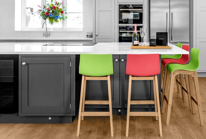
Arguably the most striking of the three types, complementary draws on contrasting colours found opposite each other on the colour wheel for an engaging and dynamic look. Whilst some designers tend to stick to two key shades, others prefer triads or multiples for eye-catching appeal.
A sophisticated purple and grey combination is ideal for a modern kitchen space with a luxurious and elegant flair. Conversely, a trendy turquoise and coral palette boasts a more playful and zesty radiance that is sure to catch the eye. Lime green and pastel pink can lend a fresh springtime feel and soft feminine aesthetic, whilst deep red and emerald green is another striking combo with subtle hints of Christmas.
By far one of the most popular colour combinations we see when it comes to our kitchen stools is a walnut finished frame with cream upholstered seats. As seen on our much-loved Alicia, the deep richness of the wood strikes a divine contrast against the soft shade of the cream upholstery.
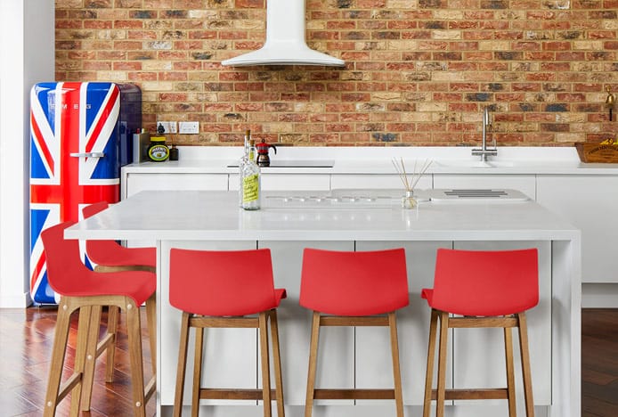
Also well-liked is the combination of a neutral black or white base tone, used on walls, cabinets and flooring, with pops of vibrantly coloured furniture and bright appliances scattered around the room for attention grabbing effect. Pictured below, our Drift Oak Stool is perfect for enhancing any breakfast bar or kitchen space with its crimson charm.
As you can see, there is no right or wrong way to use colour in the kitchen – it all comes down to the look you want to create. So whether you intend to go bold or prefer a more subtle approach, the colour wheel will help you produce a harmonious and welcoming space that is sure to impress your guests.
Recommended Articles
Greenery: Colour of the Year 2017
The must-have colour of the year is Greenery, a fresh and revitalising shade..
How Light Affects Colour
We explain how the colour temperature of light can have an impact on your colour scheme..
Classic Blue: Colour Of The Year 2020
This year's colour of the year is blue, the worlds favourite colour..
Marsala: Colour of the Year 2015
Colour of the year is Marsala- a deep red brown shade that's super sophisticated..
Recent Popular Posts
3 Easy Steps to Scandinavian Style in Your Home
Featuring natural materials, clean lines and light spaces, Scandi style is clean and cosy..
6 Ways to Use Texture in Your Kitchen
Six easy ways that you can use texture to liven up your kitchen design..
How to Brighten up a Dark Kitchen
Whether your kitchen's a small space, or just poorly lit, brighten it up in 5 steps..
How to Create a Cosy Corner in Your Home
Staying in is the new going out! Pop the kettle on and relax in a cosy corner..


