Radiant Orchid: Colour of the Year 2014
By Aurora Commerce, 10th September, 2014
Wherever you look, colour is everywhere – nothing and no one escapes it. But did you know there was such a thing as a globally recognised Colour of the Year? Launched annually by worldwide authority on colour, Pantone, it influences everything from furniture, interior design, fashion and textiles, to print, graphics, advertising and digital technology.

Whether choosing paint swatches when redecorating, or simply in selecting the font colour on your computer, you’ll no doubt have come across Pantone before. Best known for their ground-breaking ‘Pantone Matching System’, this landmark standardised colour guide helps designers, companies and individuals alike not only recognise and accurately match colours, but explore and communicate them effectively.

Gathering a cabinet of colour experts, Pantone leave no stone unturned as they scour the world for inspiration, perusing the different shades and hues used in everything from popular culture and the arts scene, to geographical landscapes and much-loved travel hot-spots. Whilst past colours have included a spectrum of shades from Emerald Green to Blue Iris, 2014 sees the selection of Radiant Orchid as this year’s key colour trend.
From Cadbury’s chocolate to Hallmark greetings cards, the purple family – from violet to mauve to lilac - is renowned for inspiring creativity and imagination. Radiant Orchid is no different, a charming shade sure to inspire innovation with its enchanting and alluring aesthetic. Whilst the ‘radiant’ is down to the beautiful sheen and undeniable vivacity it displays, the ‘orchid’ lends an exotic warmth that sets it apart from the rest.

Magnificently modern, it exudes a fresh versatility that’s much sought after. With a mystical complexity it contains various undertones which allow it to combine harmoniously with a multitude of other colour variations. Ideal for use in interior design, it can be successfully blended with both warm and cool shades, from reds to yellows to greens. A strong solid colour, its bold beauty will also add a spark to simple, plain or neutral interiors. With a cool confidence and elegant intensity, it’s ideal for revitalising its surroundings without overwhelming them.
What’s more, Colour of the Year is not restricted to one field or genre. Whilst popular in furniture design, Radiant Orchid also featured heavily on the catwalks earlier in the year, filtering across the clothing lines of some of the biggest names in fashion. Furthermore, its attractive adaptability means it’s not just limited to any one season, but will flourish all year round.
In keeping with this current colour trend, we’ve introduced a plethora of perfectly purple products to our ever-expanding range. The Lush Brushed Steel Bar Stool Purple is a fabulous example, upholstered in fashionable faux leather with chic stitched detailing.

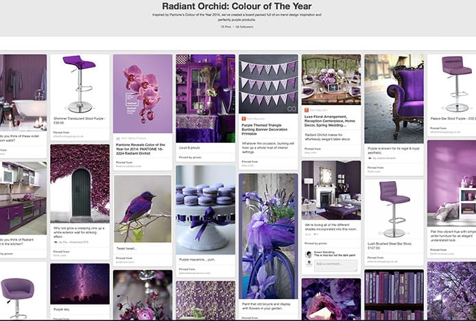
Radiant Orchid Pinterest Board
So, what do you think of 2014’s Colour of the Year? Want to embrace it in your home? Why not check out our Radiant Orchid Pinterest board for plenty of innovative interior inspiration.
Recommended Articles
Greenery: Colour of the Year 2017
The must-have colour of the year is Greenery, a fresh and revitalising shade..
How Light Affects Colour
We explain how the colour temperature of light can have an impact on your colour scheme..
Classic Blue: Colour Of The Year 2020
This year's colour of the year is blue, the worlds favourite colour..
Ultimate Grey & Illuminating: Colour of the Year 2021
2021’s colours of the year have arrived. Get inspired with shades of grey and yellow..
Recent Popular Posts
3 Easy Steps to Scandinavian Style in Your Home
Featuring natural materials, clean lines and light spaces, Scandi style is clean and cosy..
6 Ways to Use Texture in Your Kitchen
Six easy ways that you can use texture to liven up your kitchen design..
How to Brighten up a Dark Kitchen
Whether your kitchen's a small space, or just poorly lit, brighten it up in 5 steps..
How to Create a Cosy Corner in Your Home
Staying in is the new going out! Pop the kettle on and relax in a cosy corner..


